3D Network Visualization
Client
Mount Sinai - Gumus Lab
Team
Shreya Chandrasekar, Irene Font Peradejordi
Location
NY, NY
Year
2020
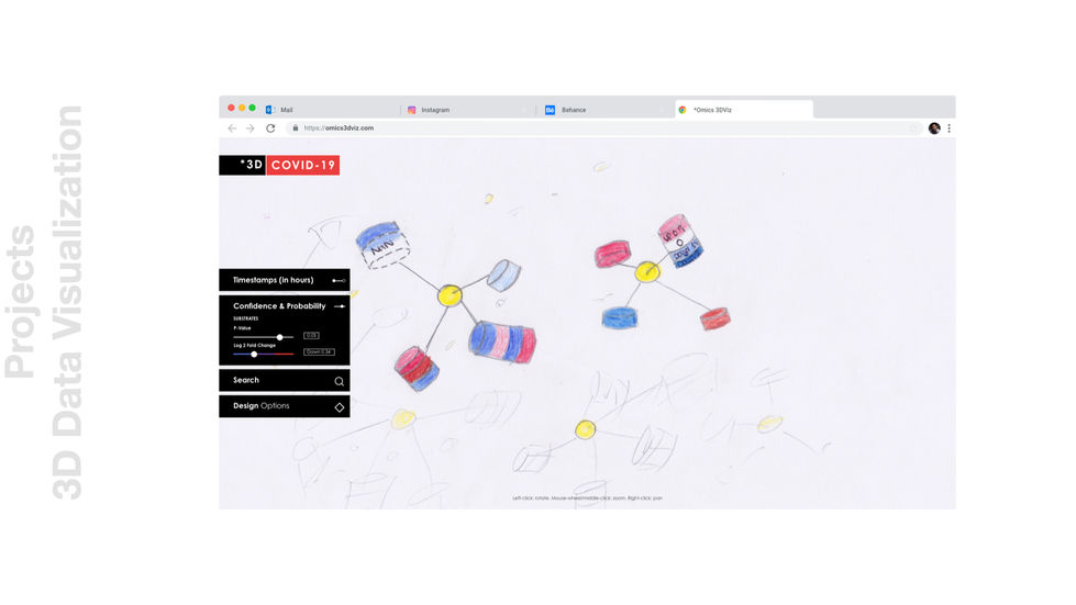
Current tools to explore large proteomics datasets are not ideal, and arranging the data in a way that drives insights can be a very time-consuming and tedious task for researchers in the field. In this work, we design and implement a web-based, user-friendly 3D data visualization tool that aims to facilitate the interactive exploration of immune-specific proteomics datasets with two main objectives: (1) enable researchers’ interactive exploration and understanding of large, complex immune-specific proteomics data, and (2) facilitate the communication of researchers’ findings to scientific and nonscientific communities through the tool.
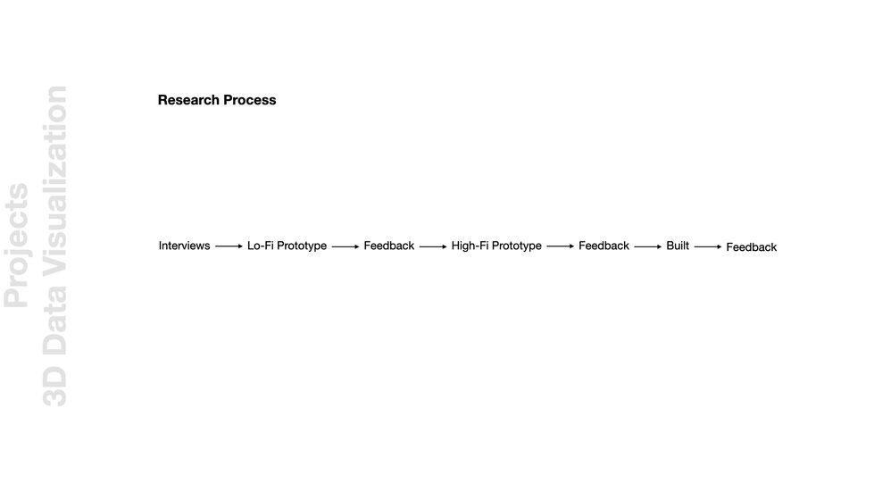
The Process
The Final Result

To better understand the human immune system and how diseases influence immune cells and protein expression, researchers are profiling immune cells before and after infection, vaccination, or treatment, collecting massive *omics datasets. More specifically, some of these researchers are studying protein phosphorylation and interactions, analyzing perturbations in the system depending on the state of infection.
This phosphoproteomic data is complex and is best represented and understood with a network visualization. Typically, nodes are kinases or substrates, which are types of proteins, and edges are interactions between them. A tool that allows researchers to visualize this data in an intuitive, interactive, and unbiased way can help them better understand the immune system, what components are perturbed in disease states, and how to reverse these changes to better treat infectious diseases such as HIV or COVID-19.
Researchers’ current workflow when analyzing their collected data demands a multi-week process, importing nodes and edges into a tool and manually adjusting parameters and thresholds for which data will appear in order to maximize usefulness, minimize clutter, and improve the aesthetics of the visualization. This process can be improved with scripting languages, such as Perl, but researchers should not need to learn these programming skills in order to create a network visualization.
Although some network visualization tools already exist, they are not ideal since creating or fine-tuning a network requires a lot of time, and the range of parameters that can be tuned is limited. A UX benchmark analysis of existing tools is provided in this work, including both the identified downsides that are improved upon and the positive aspects that were retained in the tool.
This project addresses the following two research questions: (1) How do we facilitate researchers’ interactive exploration and understanding of large, complex immune-specific proteomics data with a user-friendly data visualization tool? (2) How do we facilitate the communication of researchers’ findings to the scientific and non-scientific communities through the tool?
Our pilot was conducted using HIV data, and further iterations were developed using COVID-19 and Chronic Fatigue Syndrome (CFS) data. All data was provided by Dr. Jeffrey Johnson and Dr. Phillip Comella from Mount Sinai.


